
A Fresh Coat of Paint for Causey
 Ricky Chilcott
Last week we launched our new website, and I have to admit something: the moment it went live, I opened Causey in the next tab and felt a little sheepish.
The website looked like the company we are today. The app, the place you actually spend your time, still looked like the company we were a few years ago. It worked. It did everything you needed it to do. But it had grown one feature at a time, and you could feel it. A bit of extra space here, a slightly different gray there, buttons that didn’t quite agree with each other about how big they should be.
You don’t notice any one of those things. You notice all of them together, as a kind of low hum. And you deserve better than a low hum. The people who use Causey are running food banks, libraries, chambers, churches, and community organizations. You’re doing hard, important work, and the tool you plan it in should feel calm and clear, not cluttered.
So we gave Causey a fresh coat of paint. It’s live today.
Where It Started
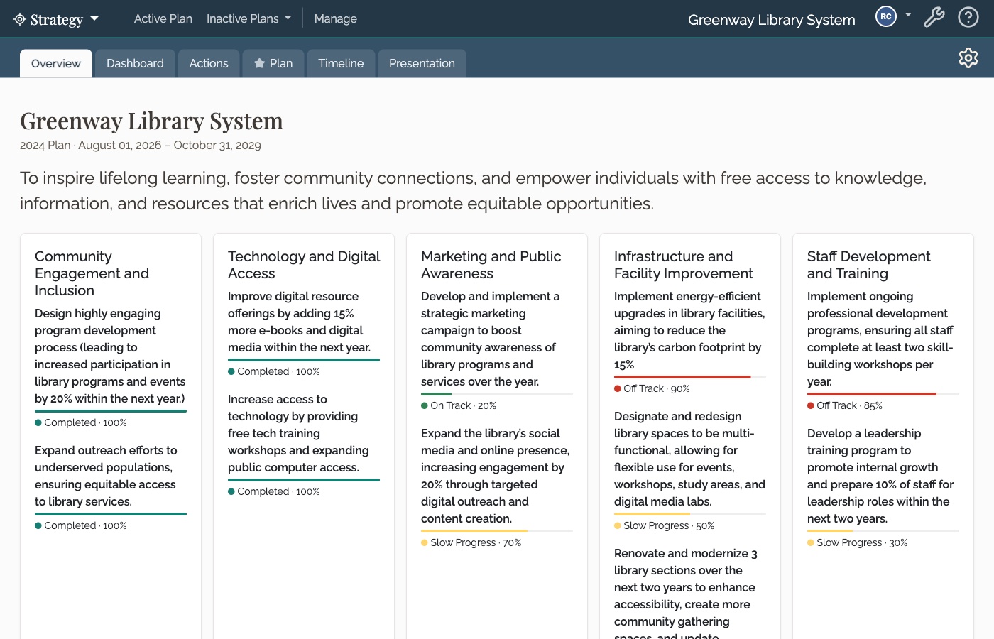
The inspiration came from inside the app. A few days ago we added the Overview tab, a single page that shows your whole plan at a glance. As we built it, it felt different from everything around it: quieter, easier to read, more confident about what mattered. I kept going back to it, and kept wishing the rest of Causey felt that way.
That became our guide. We took what made the Overview work, wrote it down as a small set of rules for spacing, color, and type, and then went through the app screen by screen and applied them.
What Changed
Nothing about how Causey works has changed. What changed is how it feels to use.
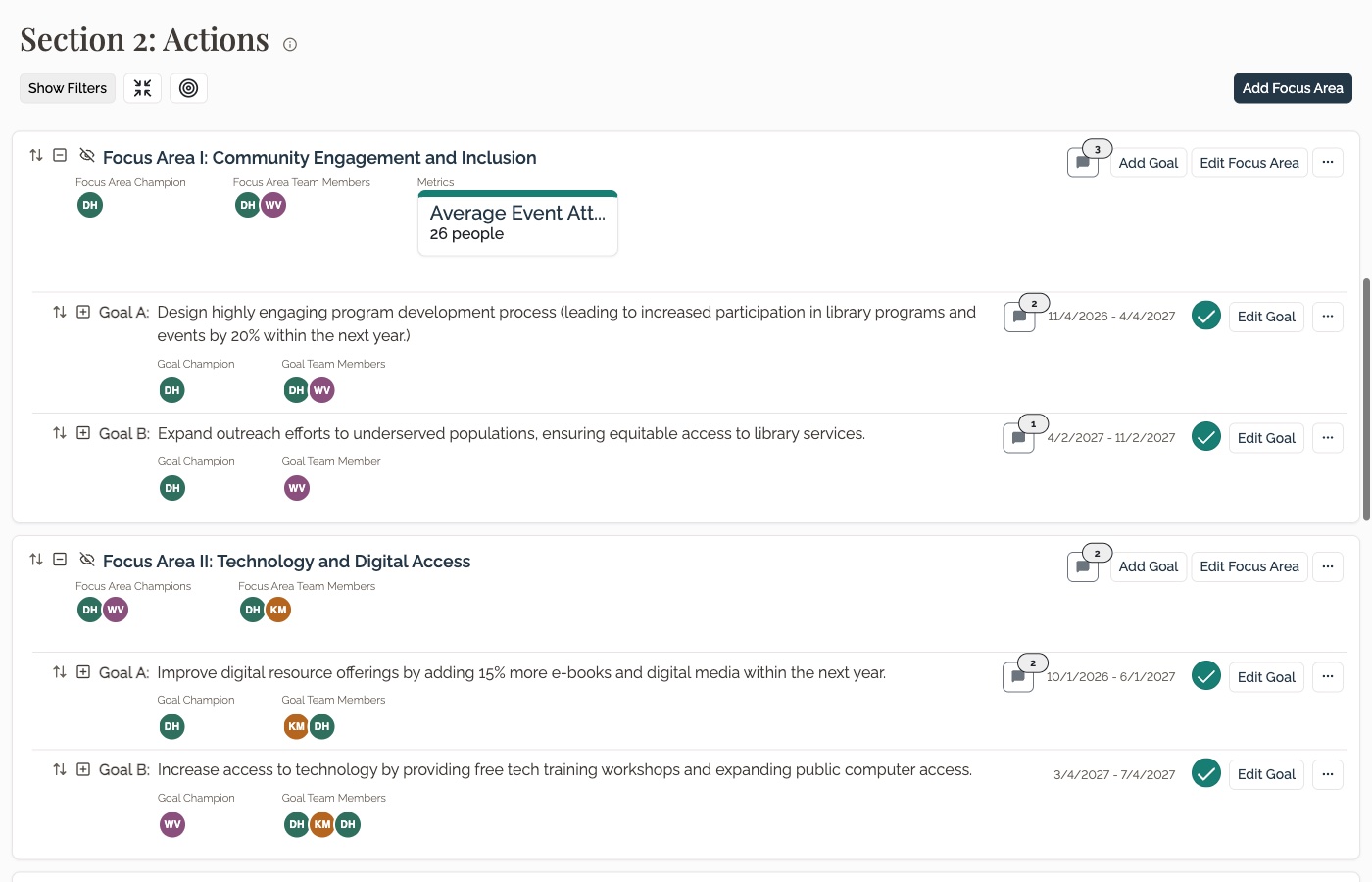
More room to breathe. Pages that used to feel crowded now have consistent spacing, so your eye can rest and find its place again.
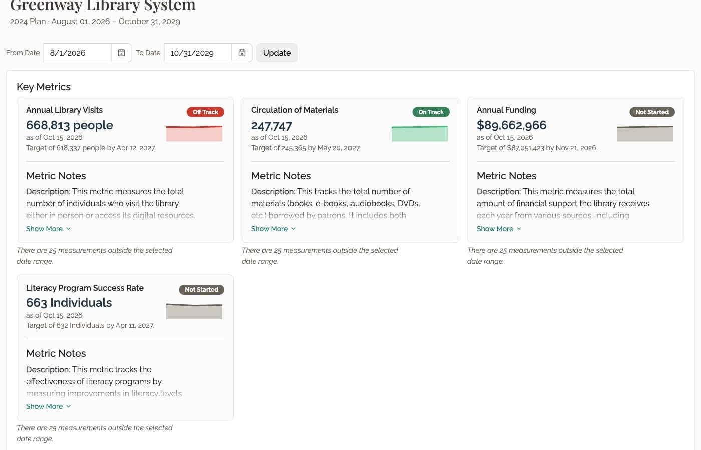
Color that means something. We pulled back on color used for decoration, so the colors that remain, like on track, off track, and slow progress, stand out and tell you something.
Clearer edges. Tabs, buttons, and cards are more clearly defined, so it’s easier to tell what you can click and where one thing ends and the next begins.
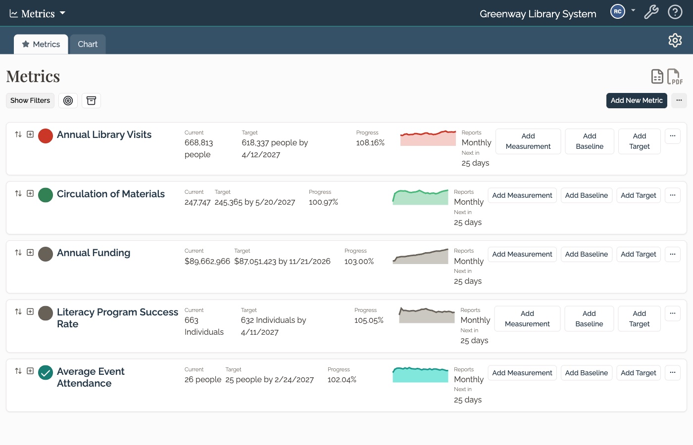
A clearer sense of what matters. On every page, the most important thing should be the first thing you see. Titles, numbers, and status now lead, and the supporting details step back.
It Should Feel Like Home
If we did this right, your first reaction won’t be “what happened?” Your workflows are the same, your plans are where you left them, and there’s nothing new to learn. Causey should feel familiar, just a little elevated, like walking into your office the morning after someone finally hung the pictures straight.
This was a long time coming, and I’m really proud of it. Thank you for trusting us with your plans, and for the patience you’ve shown while we got here.
If something looks off, or feels harder to find than it used to, please tell us at help@causey.app. We read every note, and we’ll keep polishing.
Meet the author